Wednesday, January 29, 2014

framming


 Architectural 


   My techniques for this image was lighting and how to take it from the right angle which I took straight-on angle. It looks like a really good picture the wind her stand and the lighting was perfect and the frame was great.

                                              Man-made

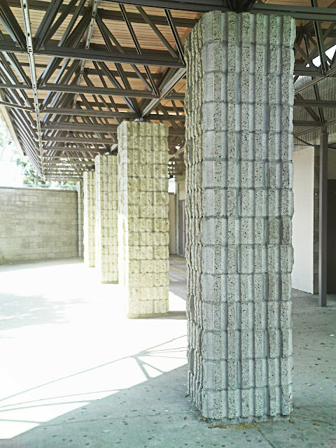
 To get this picture was really easy to find a frame that was attached to a building. To take a picture like this I had to make sure they weren't moving to much and since we were in shade I raised my ISO a little up and then I got a great picture.

                                               natural


 So to use a natural frame I didn't know what to do so I just made my hand into a shape of a circle and the picture really came out clear even though the model didn't want her face to show. The background and lighting also look great in this so i really didn't need any techniques since I took this with my phone and made sure it was in focus.

                                      Best-Of                                                                             


I think this shot was really creative because nobody had ever thought of this frame I had thought of this when I had saw leaves on the floor. What i really liked about the photo otherwise the frame was blurry nothing else was wrong so I really liked this photo and was even better taken by my phone.

Friday, January 17, 2014

blog post #13

             What I really liked about this photo was how I managed to get shallow depth of field and and how to stop their motion and get their bodies clear without any flaws. I took this photo from straight on angle but had to make sure the camera was following their movements. my setting were on tv and my f stop was on 8 and my shutter speed was at 1/250 and my iso was at 100.
   What I liked about this picture was no matter what settings I adjusted it to it wouldn't come out as right as I hopefully would have liked but then I adjusted them a little more and here is my perfect walking picture. I had taken this angle from a straight on angle to get the center attention of her face and body. my settings were on tv my f/8 and my shutter speed 1/40 ISO 100
This was a really hard photo to get it perfect at why? because its not like I can know when the car well slow down or not or go at the right speed so I can get a better picture but luckily I got the perfect picture and I love how it sin motion and i can see the car clearly. I couldn't do it straight angle so I adjusted the angle to the left and i got a perfect picture. my setting were on tv and shutter speed was on 1/100 and my f/8 and my ISO was on 100

      What I really liked about this photo was how I managed to get shallow depth of field and and how to stop their motion and get their bodies clear without any flaws. I took this photo from straight on angle but had to make sure the camera was following their movements. my setting were on tv and my f stop was on 8 and my shutter speed was at 1/250 and my iso was at 100.

Friday, January 10, 2014

composition


lines

1. In this photo I tried using different angle's to take the photo so I got on the ground looking up at the tree so I can capture this amazing photo. Luckily I hadn't really used Photoshop to adjust brightness or make the color pop out since it was perfect I had just simply just cropped it a little.


2. In this image I took this shot from straight on angle to get a better view of the four vertical walls. The thing I love about this photo is that how the sun hits the walls to give that brightness. to make this picture less blurry and a little more brightness I used Photoshop. So it can have more detail's in this photo.


3.The technique I used in this photo was, I asked one of my friends to make various poses  to make a certain angle but i loved this one the most out of all the position the vibrant color the non-blur. I had taken this photo straight on to get the full pose so you can see what angle she is making. i had used Photoshop to adjust the brightness because of all the tree's shadow's blocking the sun light from her face and the direction I wanted it to hit.


4. The technique  I had used in this photo was to just take this photo kneeling while on a small hill. I had used photoshop to add some brightness in this photo and mad sure the colors of the umbrellas look vibrant. I am amazed by this photo when I see everything is posistioned the color the chadows and the little details.