Tuesday, June 10, 2014

blog post 14

                                              standing tall


 The reason I chose this image was because of how I took in from a low angle and I like how the model was posed and how the sky was with clouds and not just clear and  I like the vibrant grass and lines. Working with the model was no problem at all she was great and i just as her to pose and I got this really amazing shot. No challenges. Taking a successful picture.


blog post final

What I really like about this photo was that how the two colors between purple and green go so well together. I also really liked how i got a shallow depth of field and got the flowers to be crisp and how this picture is so vibrant.
I really liked the light green and dark green in the background and shallow depth of field.
I really loved the crispness of the leaves and how you can tell that the image is crisp itself. The color came really well and vibrant in this photo.
This was our float project and I really like the weather here not too bright or not too dark. This picture also had great stop motion and how I got no one to be in the background so it was perfect to take a pic.
This picture screamed emotion to me and I love how I was able to grab some crisp lines in the background and tree. And i was able not to have a blurry picture without any editing except to crop a little.
For some reason I liked how the model was posed and got a little shallow depth of the background. I really thought this picture was good because I also got the hair while the weather was windy so luckily you can see her hair flowing crisp and not all blurry.
This picture was really good because shallow depth of field brings focus in what you want the viewer to see so our attention was on the bottle of lotion. I also like the lighting we were at because the lotion bottle wasn't at washed out as it was alot so i overcome that challenge.
I love how the flower is the only focus you should have your eyed on I also love how the flower is so vibrant with yellow. The background was a dark green and some highlighted parts that brought out the brightness in the flower.
Motion stop was amazing the vibrant green background really brought her out and her skin tone. I like how I was able to catch her in the air with her hair not a blur but full on stop in focus. I was glad when a little part of her face was showing so that we can see her fun face expression.
   I liked the angle I took of this of this picture which was called birds eye. I like the bright colors of the bowling pin and her shirt bouncing off each other. The picture itself was good and i like how the colors in the pic weren't to bright to make the pic over exposed.

  • My favorite thing to do in the class was getting to know photography on a different level and learning new thing also taking pictures was really fun and meeting new people. 
  • I believe that the most important thing we learned was how to stop motion and shallow depth of field were really important to learn and how to use Photoshop to learn different varieties of what we can learn and experiment with.
  •  The advice I would give to students next year is that this class inst really hard only if you make it hard and that Photoshop can be your best friend at time not to fix you in general but to help the picture a little bit more and experimenting with your photos
  • photography is awesome.

blog post product ad


I

Thursday, April 24, 2014

blog post 13

      I really had some trouble with my zombie self portrait me because I thought it was going to be easier but it wasn't but I used bacon as my layer for my skin and to add more specialty to it i added a beer can to my head and used a blood splatter brush which really helped it look a little more realistic.
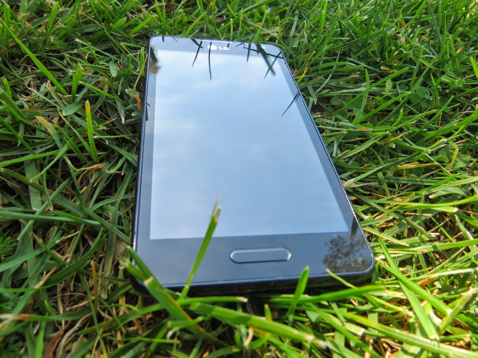
 I would choose my phone in case I can make calls if I reach a spot with WiFi or get bars I also liked how the picture came out it was the perfect place.
I chose a car so I could hot wire it and drive or hope the the guy left his keys in there.
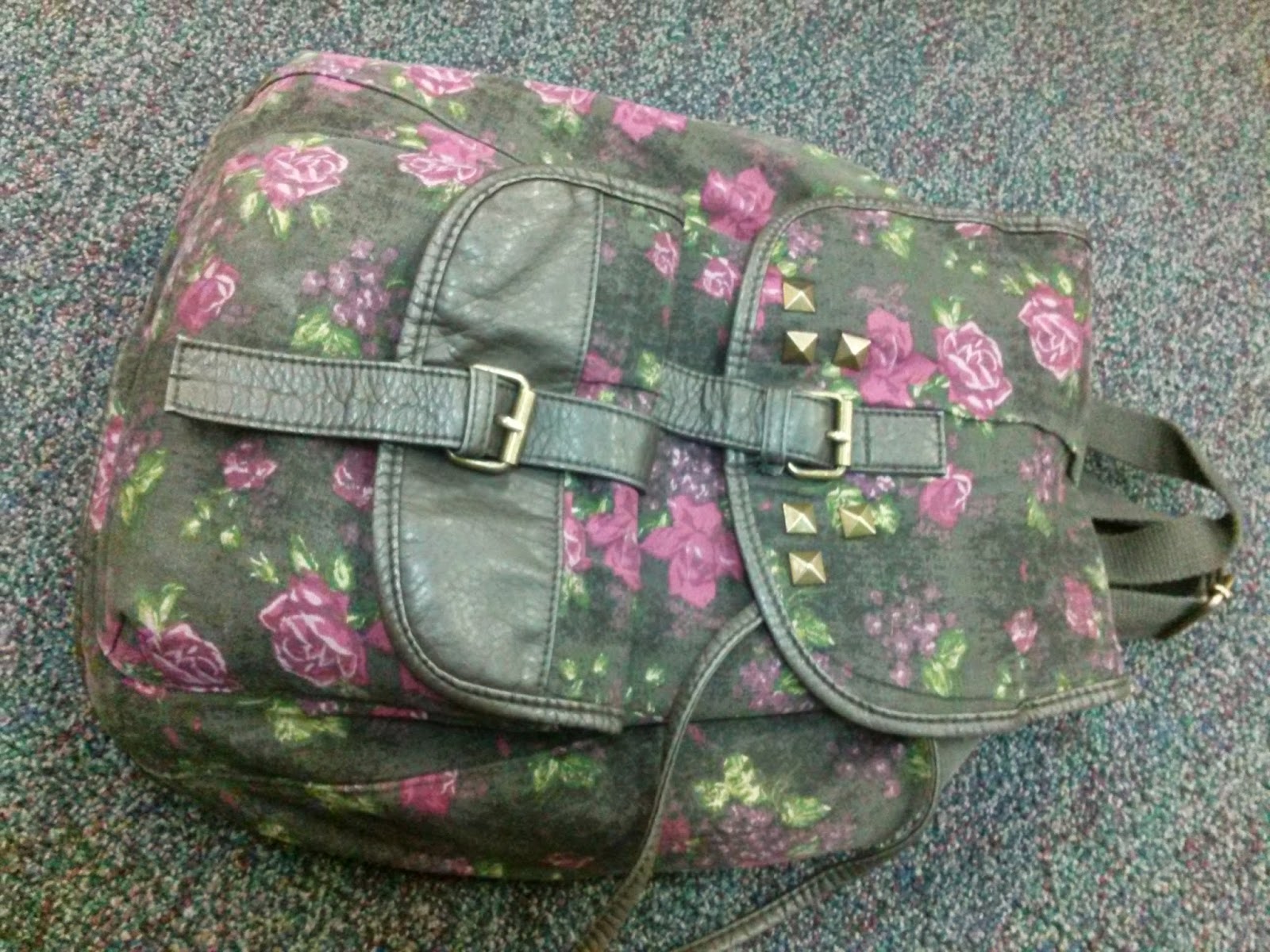
I chose my backpack because dora taught me you should always carry a backpack and a monkey jk in case to put important items in there

Thursday, March 20, 2014

Blog post#12 inner child


              cindy!


         I chose this picture because it was a complicated one and the background lighting was one of them because it was brighter than the person herself. I also chose this picture because out of all mostly this one was one of my best. To get this picture i had to choose auto tone auto color and I forgot the other one i also had to adjust the brightness background of the picture but I added some brightness back in her skin and color by using the mask on the brightness adjustment.


  I chose this picture because I really like how the model was posing and I used the same adjustments as i did for the first picture. Like the other picture the background was overexposed so i had to work on that with the brightness adjustment.


                                           jacob


      This picture I chose because getting a great emotion which was love struck by the way as if he saw his crush which might have happened? Anyway I really liked how this background had no problems what so ever with lighting detail color nothing!


     I really enjoyed this picture although model was kinda difficult yet I caught him off guard which wasn't so bad. I liked the lighting and no washed out background difficulties. And I didn't haft to use Photoshop at all the picture was fine on its own.


  • I'm going to be honest Cindy was fine she did all the right expressions with out me telling her what to do at all. But Jacob what so ever was VERY DIFFICULT he was emotionless and every time I would tell him to be the emotion curious or surprised he would just give me a confused look.
  •  Well the things I had to overcome with Jacob was with trying to set a theme which was also not easy but i got a little expression out of him but also needed help to setting up a theme with the help of Cindy and Alison.
  • That my successes were getting all my model's face expressions in time and getting them done early.
  • Being a model is at first awkward with someone you don't really know but it was fun making weird faces is the best and better when being graded and raising up my grade just to earn them but then you see that one photo which makes regret being a model. 
  • I think it can help you because being a model is a example and you get to show the other model how to act and set up a scene that you can imagine in your head so that can probably help.
  • When we do portrait pictures all i haft to be excited is about is all the good photos we take and the ones that make me look like something i would never had the expression to do.
  • Well i'm worried about models I had difficulties with one i hope to get more expressions out of them and if the models aren't happy about the photos or i'm not happy about them.


Wednesday, January 29, 2014

framming


 Architectural 


   My techniques for this image was lighting and how to take it from the right angle which I took straight-on angle. It looks like a really good picture the wind her stand and the lighting was perfect and the frame was great.

                                              Man-made

 To get this picture was really easy to find a frame that was attached to a building. To take a picture like this I had to make sure they weren't moving to much and since we were in shade I raised my ISO a little up and then I got a great picture.

                                               natural


 So to use a natural frame I didn't know what to do so I just made my hand into a shape of a circle and the picture really came out clear even though the model didn't want her face to show. The background and lighting also look great in this so i really didn't need any techniques since I took this with my phone and made sure it was in focus.

                                      Best-Of                                                                             


I think this shot was really creative because nobody had ever thought of this frame I had thought of this when I had saw leaves on the floor. What i really liked about the photo otherwise the frame was blurry nothing else was wrong so I really liked this photo and was even better taken by my phone.

Friday, January 17, 2014

blog post #13

             What I really liked about this photo was how I managed to get shallow depth of field and and how to stop their motion and get their bodies clear without any flaws. I took this photo from straight on angle but had to make sure the camera was following their movements. my setting were on tv and my f stop was on 8 and my shutter speed was at 1/250 and my iso was at 100.
   What I liked about this picture was no matter what settings I adjusted it to it wouldn't come out as right as I hopefully would have liked but then I adjusted them a little more and here is my perfect walking picture. I had taken this angle from a straight on angle to get the center attention of her face and body. my settings were on tv my f/8 and my shutter speed 1/40 ISO 100
This was a really hard photo to get it perfect at why? because its not like I can know when the car well slow down or not or go at the right speed so I can get a better picture but luckily I got the perfect picture and I love how it sin motion and i can see the car clearly. I couldn't do it straight angle so I adjusted the angle to the left and i got a perfect picture. my setting were on tv and shutter speed was on 1/100 and my f/8 and my ISO was on 100

      What I really liked about this photo was how I managed to get shallow depth of field and and how to stop their motion and get their bodies clear without any flaws. I took this photo from straight on angle but had to make sure the camera was following their movements. my setting were on tv and my f stop was on 8 and my shutter speed was at 1/250 and my iso was at 100.

Friday, January 10, 2014

composition


lines

1. In this photo I tried using different angle's to take the photo so I got on the ground looking up at the tree so I can capture this amazing photo. Luckily I hadn't really used Photoshop to adjust brightness or make the color pop out since it was perfect I had just simply just cropped it a little.


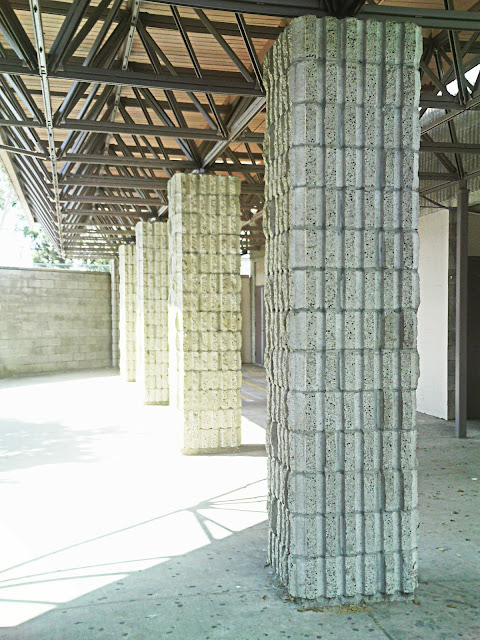
2. In this image I took this shot from straight on angle to get a better view of the four vertical walls. The thing I love about this photo is that how the sun hits the walls to give that brightness. to make this picture less blurry and a little more brightness I used Photoshop. So it can have more detail's in this photo.


3.The technique I used in this photo was, I asked one of my friends to make various poses  to make a certain angle but i loved this one the most out of all the position the vibrant color the non-blur. I had taken this photo straight on to get the full pose so you can see what angle she is making. i had used Photoshop to adjust the brightness because of all the tree's shadow's blocking the sun light from her face and the direction I wanted it to hit.


4. The technique  I had used in this photo was to just take this photo kneeling while on a small hill. I had used photoshop to add some brightness in this photo and mad sure the colors of the umbrellas look vibrant. I am amazed by this photo when I see everything is posistioned the color the chadows and the little details.